 Mailnatives
  2026-04-16 07:30:38
  3 min reading
Pop-ups are among the most powerful tools for collecting emails and increasing conversions. At the same time, however, they can be a source of frustration if they are not designed carefully. A successful campaign is based on understanding human behavior – when, to whom, and how to display it. Here is an overview of the key principles that determine whether your pop-ups will work or, on the contrary, cause harm.
The psychology of pop-ups is not about being the most visible – but about being useful and well-timed. A pop-up that respects user behavior, is visually consistent, and offers relevant value can significantly increase conversions and overall visitor satisfaction.
General recommendations: when pop-ups help and when they annoy
The basic rule of pop-up psychology is: respect the visitor's intention. In other words, a pop-up should help at the right moment, not interrupt a useful activity.
Pop-ups work great when:
- they catch the user at the right moment (e.g., when leaving),
- they provide real value – a discount, benefit, inspiration,
- they have a simple and clear message,
- they are design-coordinated with the website,
- they do not prevent the visitor from completing the action.
Pop-ups are annoying when:
- they pop up immediately after the page loads,
- they cover the content the user is currently reading,
- they appear repeatedly regardless of behavior,
- they are too aggressive, flashing, or visually inconsistent,
- they offer low value or unrelated messages.
Examples of annoying vs. friendly campaigns
User response?
"Leave me alone! I haven't even seen what you're selling yet."
- Appears 0.5 seconds after the page loads.
- Covers content on mobile devices without the option to close.
- Offers a generic discount, even if the user came from a newsletter.
- Looks like an ad rather than part of the website.
User-friendly campaign
User response?
"OK, this makes sense. Maybe I'll find it useful."
- It only appears when the user has shown interest – for example, after scrolling 50% of the way down or when leaving.
- It is compact and not overwhelming.
- It contains clear value ("Tips for choosing size + 5% discount").
- Visually matches the website – same colors, icon set style, fonts.
- Easy to close.
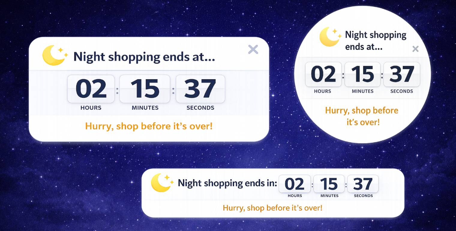
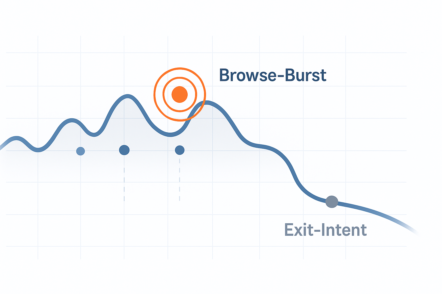
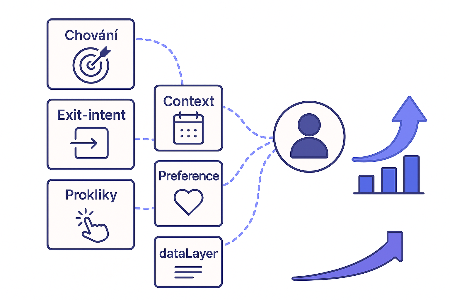
Timing is key: when and what to display
Timing is perhaps the biggest psychological factor. The right moment can increase pop-up performance by hundreds of percent.
Ideal examples of timing
- Exit intent → captures a departing visitor without interrupting their reading.
- Scroll 50–70% → suitable for technical articles or blogs where the user has shown interest.
- Idle time → after a few seconds of inactivity.
- Back-button detection → captures visitors comparing prices.
Example: satisfaction survey in the post-purchase process
A survey inserted into a pop-up with great timing:
- appears only after the order is completed,
- at a time when the user has just experienced positive emotions from the purchase,
- contains short, simple questions.
This psychological window (known as the post-purchase high) not only increases conversion rates, but also the quality of responses – users are more responsive and motivated to help.
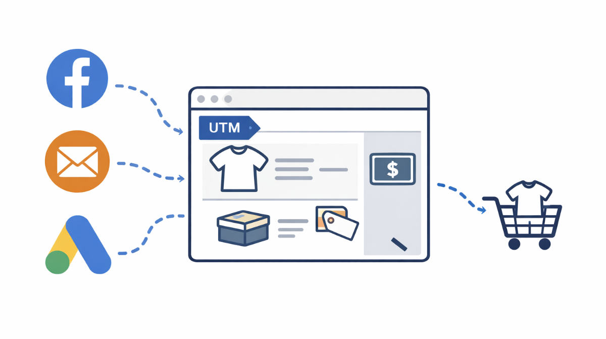
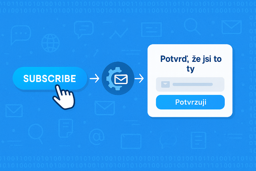
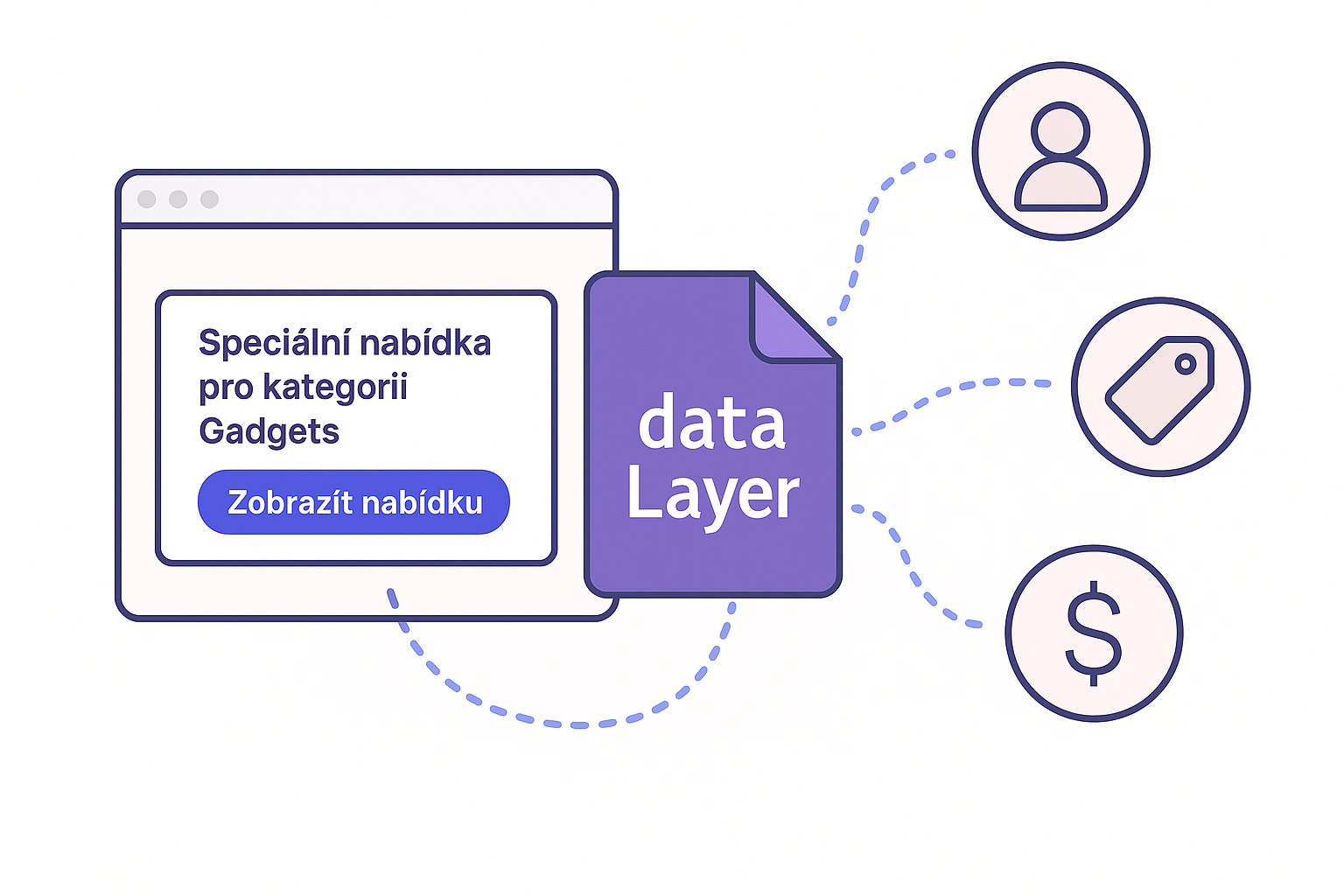
Personalization and content relevance
A pop-up should not appear as a foreign element. The more it adapts to the context, the better it works.
Personalization can be simple – even adding the name of the current category to the headline significantly increases relevance and perceived value.
Practical tips:
- Maintain the color scheme and visual style of the website.
- Tailor the claim to what the user is currently doing:
- "Want skincare tips?" → on a cosmetics blog.
- "Get a discount on dietary supplements" → in the vitamins category.
- Pre-fill data if you know it.
- Don't ask questions you already know the answer to.